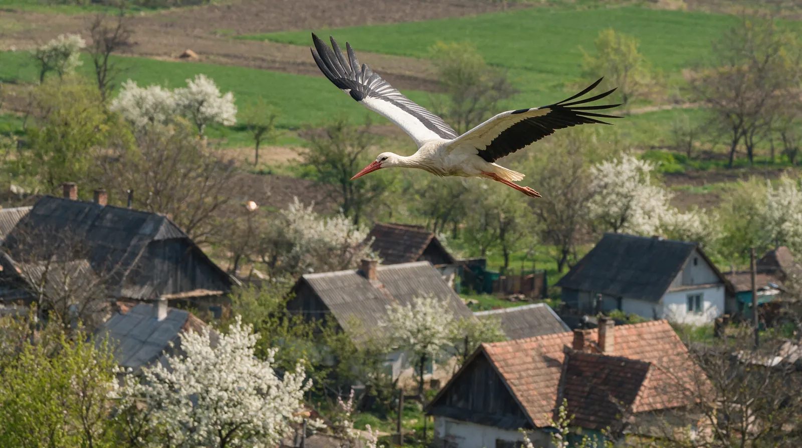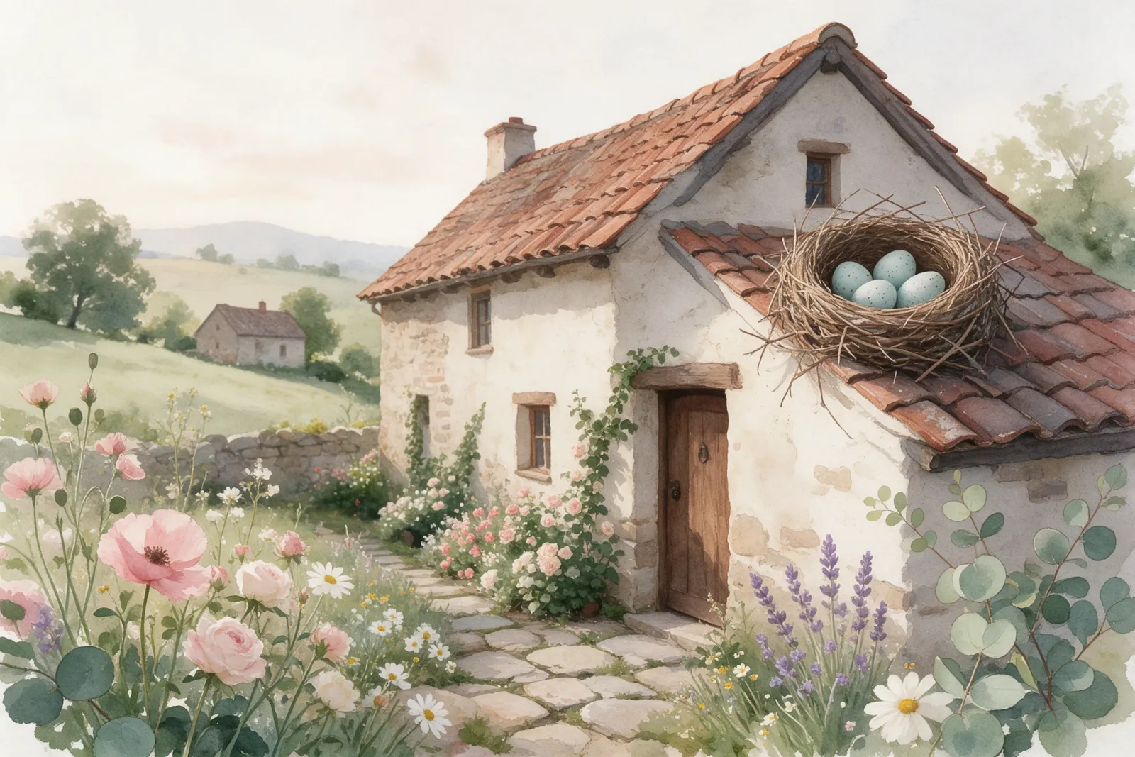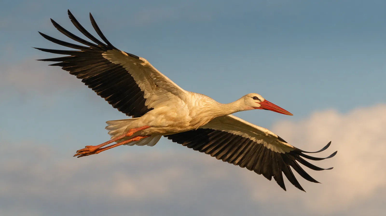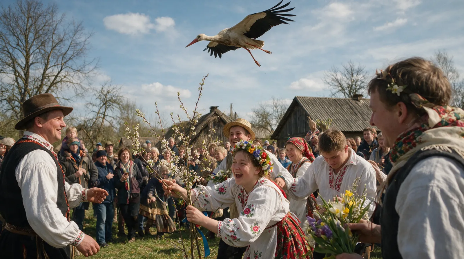
Stork tattoo styles divide by line, colour, and how much of the bird's story the design tries to tell. The same white bird can read as a folk emblem, a delicate sketch, a bold traditional flash, or a Japanese-inspired study of wind and water. The style changes the meaning as much as the outline.
Fine line and single needle
Fine line suits the bird's long bill, thin legs, and clean white body. A single-needle stork can look like a pen drawing, with the red bill and legs reduced to a thin wash of colour. The risk is scale. At small sizes the legs can become a pink haze and the bill can lose its shape. Fine line works best when the bird is given enough room to breathe. Ask for enough contrast in the wing tips, and keep the nest simple if there is one. A delicate stork on a forearm or a shoulder blade can hold for years with care.
American traditional
Bold outlines, a limited palette, and a shape that reads from across a room. A traditional stork usually comes as a folk emblem: a bundle, a rooftop, a banner, or a pair of birds. The colours are black, red, yellow, and green, and the shading is simple. The bird's shape survives because the outline is plain. Traditional designs age well because they do not depend on detail. A stork with a bundle in this style looks like a sign, and a sign is what the old tattoo vocabulary does best. Placement on a shoulder, a chest, or a thigh gives the design the weight it expects.
Blackwork and engraving
Blackwork drops the red and lets the bird become a drawing. Engraving style uses hatching and fine parallel lines, the look of an old natural history plate. The white stork becomes a study in black and skin, with the wing tips and the bill carrying the contrast. This approach suits a large piece on a back, a thigh, or a rib. The stork's long legs and straight bill are made for a vertical composition. A blackwork bird can be stark or soft, depending on the density of the lines. It needs an artist who understands how hatching settles into skin.
Japanese-influenced designs
Japanese tattoo tradition does not use the stork as a standard motif; the crane is the bird of longevity in that vocabulary. A stork can still be drawn with Japanese conventions: wind bars, water, a strong diagonal, and a limited but saturated palette. Be honest with the artist about the difference. A crane and a stork have different bodies, and a design that splits the difference will look like neither. The useful borrowings are composition and background, not the bird's identity. A stork over water, with wind bars behind it, can carry the calm of that tradition without pretending to be a crane.
Neo-traditional and colour
Neo-traditional keeps the bold outline and adds a wider palette, more movement, and decorative elements. A stork in a sunset, a stork among flowers, a stork over a stylised field. The style allows colour in the sky and the ground, which can make the white bird stand out. It also tempts the design toward clutter. Keep one idea in the background and let the bird own the foreground. A stork needs empty space around it to look like a stork.
Placement, scale, and ageing
A stork is a long, vertical bird, and the placement should give it length. Forearm, calf, thigh, rib, and shoulder blade all work. Small designs on fingers and wrists blur faster, and the bill is usually the first detail to go. Sun, friction, and time soften every tattoo, so build the design around shapes that survive. Thick outlines, clear wing tips, and a simple nest will still read in twenty years. A detailed feather pattern will not. If the design is for a birth, the stork gift can carry the same image on paper, with a name attached.
Explore the gift